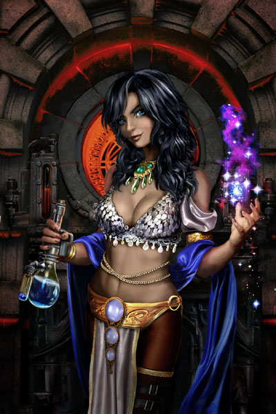
We’re talking with the DYNASTY OF MARS cover artist that everyone’s buzzing about, the talented Adam Diller. Since his image of Princess Aria hit the internet it’s caused a good deal of comment, envy, and, er, a certain degree of lust. So here’s the man who crafted it, and we get to ask him questions.
Adam, what’s your art background? Why haven’t you done dozens of gorgeous covers like this one?
ADAM: I have a fine arts degree, but cover images and the like aren't normally my thing. I've been working in the video game industry for the last decade or so, mostly providing concept artwork that the public rarely gets to see. As such, I've had plenty of opportunity to draw and design steampunk environments, odd machinery, weapons, vehicles, and yes, even the occasional scantily clad heroine. So ultimately, the cover image wasn't too outside my wheelhouse.
What was your brief for the cover? You’d done a couple of other images that I.A. Watson let us have as place-holders, but I heard you specifically wanted to do Aria. What did they tell you they wanted, and what did you want to do yourself?
ADAM: Well, their first request of me was actually much simpler... I was approached about giving approval for the use of a previous image of mine. However, Mr. Watson happened to let slip in the request "Alternatively, if you have any images of dark-haired Martian princesses... I'd be happy to consider them.". He had the good timing of contacting me directly after I had completed a somewhat tedious assignment, and suddenly drawing a dark-haired Martian princess seemed like a fine way to recharge the creative batteries. Unfortunately, since they were originally only looking to get approval and not commission a whole new piece, there wasn't actually much time set aside before they needed a final image completed. I proposed that they give me two days to produce some artwork of the princess, and should they not like it then I'd sign off on the piece they originally inquired about.
I have no doubt the image could have been greatly improved with some time to actually go through the proper stages of compositional lay-out, rough draft, feedback, etc., but as an artist it's quite liberating to just dive straight into a piece and work straight through to completion while not having to beg permission for any artistic whims along the way. Aside from some valuable broad-stroke descriptions and an excerpt from Mr. Watson, there really wasn't any time for specific requests or instructions on the final image. They simply let me loose and hoped for the best, I imagine.
 Looking at the picture, it seems to me there’s all kinds of points of interest. You’ve framed Aria in front of a focusing circular window that’s kind of grungy and steampunk. She’s got that little sparkle of magic lighting her left side and that groovy illuminated bottle to the right, and so on. How did you go about deciding on the elements of the image and where the balances would be?
ADAM: Instinct, experience and a fair amount of luck, largely. It's a very straight-forward character portrait, which saved me from having to work out any complex poses or actions (again, this was necessitated largely due to the time crunch, but then I've often preferred such simple portraits to full-blown story illustrations as cover choices myself.) As described to me, the world was a mix between unusual technology with perhaps a steampunk flair and a bit of sorcery, and so I went with a very literal balance of magic on the one hand and an odd bit of chemistry in the other. With reduced time to do traditional painting from scratch, the background is composed entirely of photographs I have taken over the years for the reference and the texturing of video game assets, collaged together and painted over to create the grungy, stonework-and-sci-fi backdrop to her. Elements of her outfit were done in the same way.
While the descriptions and genre of the story called for a certain amount of sex appeal with the image, I definitely wanted her to look like a capable protagonist and not in any way the damsel or "prize" for the conquering hero to win. Formidable, but not unduly threatening either. She was certainly a fun character to work on.
Can you tell us a little bit about your influences? What comes together to make a gothic, mystic, heroic, even mischievous picture like this? Who are the art heroes in your head when you make this kind of image?
ADAM: When it comes to cover images of beautiful women, it's certainly easy to have the work of comic book artist Adam Hughes come to mind. However, I'd say a large influence on this kind of portrait cover came from the fantasy novels I read growing up and the work of artists like Larry Elmore, who I was a fan of at the time. An attractively done cover image of an intriguing character was often more than enough to make me stop and flip a paperback over to read the back.
 If people want to see more of your work where do they go?
ADAM: Hmmm... their local video game store, perhaps? Some social networking games, as well as checking out phone apps... I've had a hand, large and small, in a pretty wide variety of projects at this point, from latest generation console shooters to cartoon-based puzzle games. For a great number of them, even I don't know much more about them than the working titles under which they were developed. Add that the vast majority of my professional output is owned by my clients and that I've never been one for web site maintenance, and the result is that any site I might direct people to will likely be woefully out-of-date and not particularly representative of me anyway.
I'm obviously quite poor at promoting myself... but rest assured that I'm out there quietly trying to make the world a more entertaining place from behind the scenes.
I don’t know if you saw out letters page – which had a whole bunch of folks including some writer and artist pros drooling over your work – but there was also a call for a poster of your pic. Any chance of that?
ADAM: I suppose it's possible, although at the moment I have no idea what that would entail. I'm certainly flattered and pleased to hear that people have taken to it to that degree. When you tackle something like this for the sheer fun of doing it more than anything, that kind of feedback is all the more meaningful and appreciated.
And what do we need to keep an eye out for next from Adam Diller?
ADAM: Undoubtedly something for which I've signed a non-disclosure agreement. Damn lawyers.
Thanks for sharing, Adam. There’s already rumors about award nominations for your picture. We wish you every success.
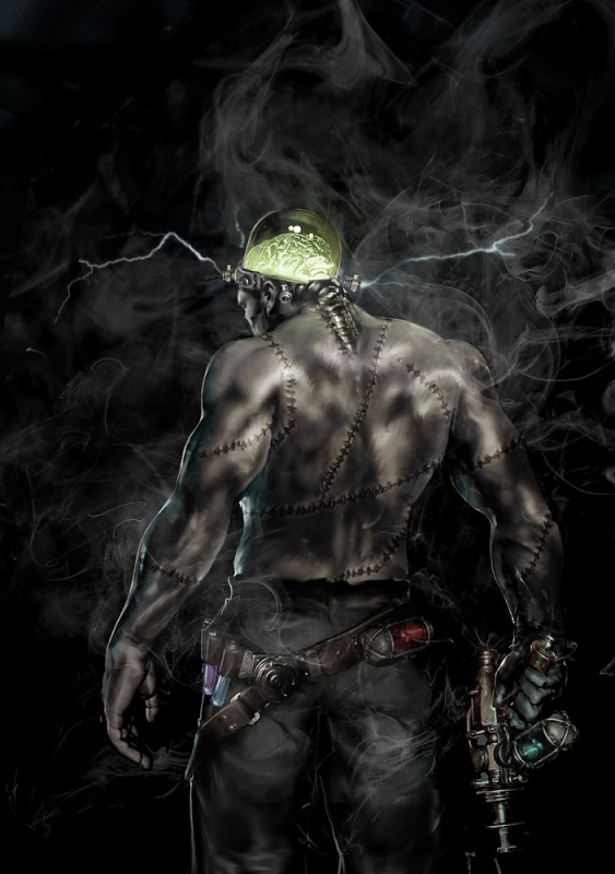
By the way, that's not meant to be Adam in the picture at the top of the page - at least we think not. It's not him in the third one either. It might be Van Plexico.
We reserve the right to edit your comments but we won't change the sense of them. Comments in this page reflect the views of the people making them and don't neccessarily reflect the opinions of our creators or staff.